The wordmark Utsahh! (Hindi) means Enthusiasm and is defined as intense and eager enjoyment, interest, or approval.
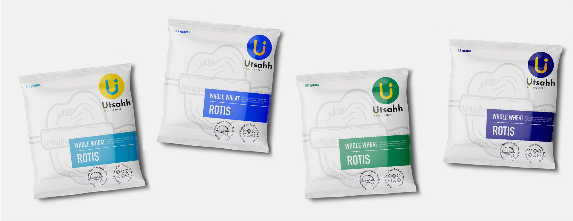
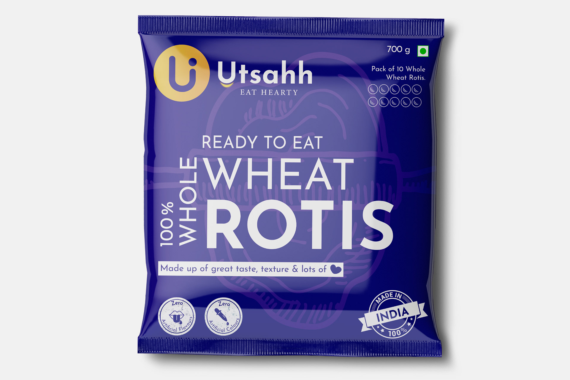
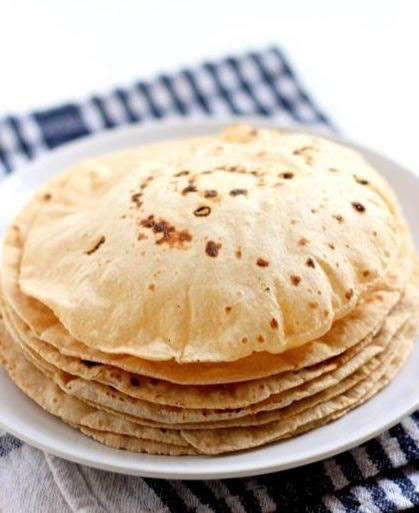
The logo is the rounded alphabet U which comes from the wordmark and ends with a circle on one end which signifies the round shape of a roti. Another variation of the logo ends with a flame on top of a “U” which signifies the hot and delicious spices used in the ready to make gravy products. These two variations are to be used for “Rotis” and “Gravy” products respectively.
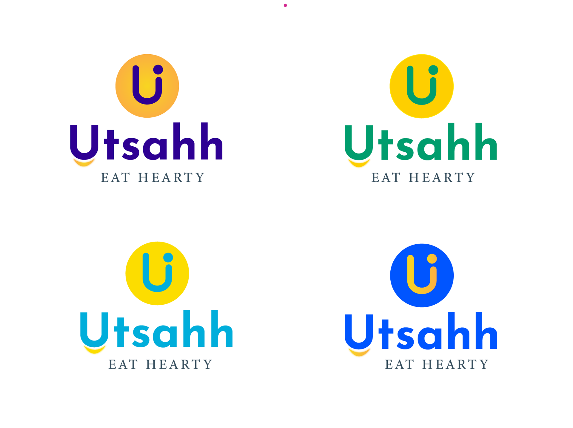
It comprises of a petite glowing smily under the wordmark and would stay consistent throughout the branding of all products. The English version of the logo is followed by a concept statement saying, “Eat Hearty” and that is what our brand aims to do; fulfil your hunger quest with vital and delicious food.
The logo uses negative space as it’s core design element and the colors would switch with respect to the branding of different sub-categories of products.
Logo Options
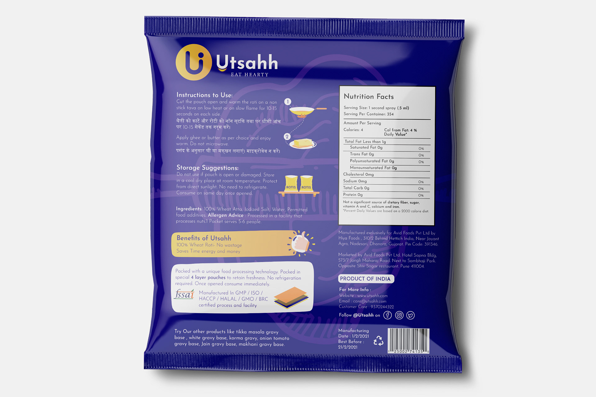
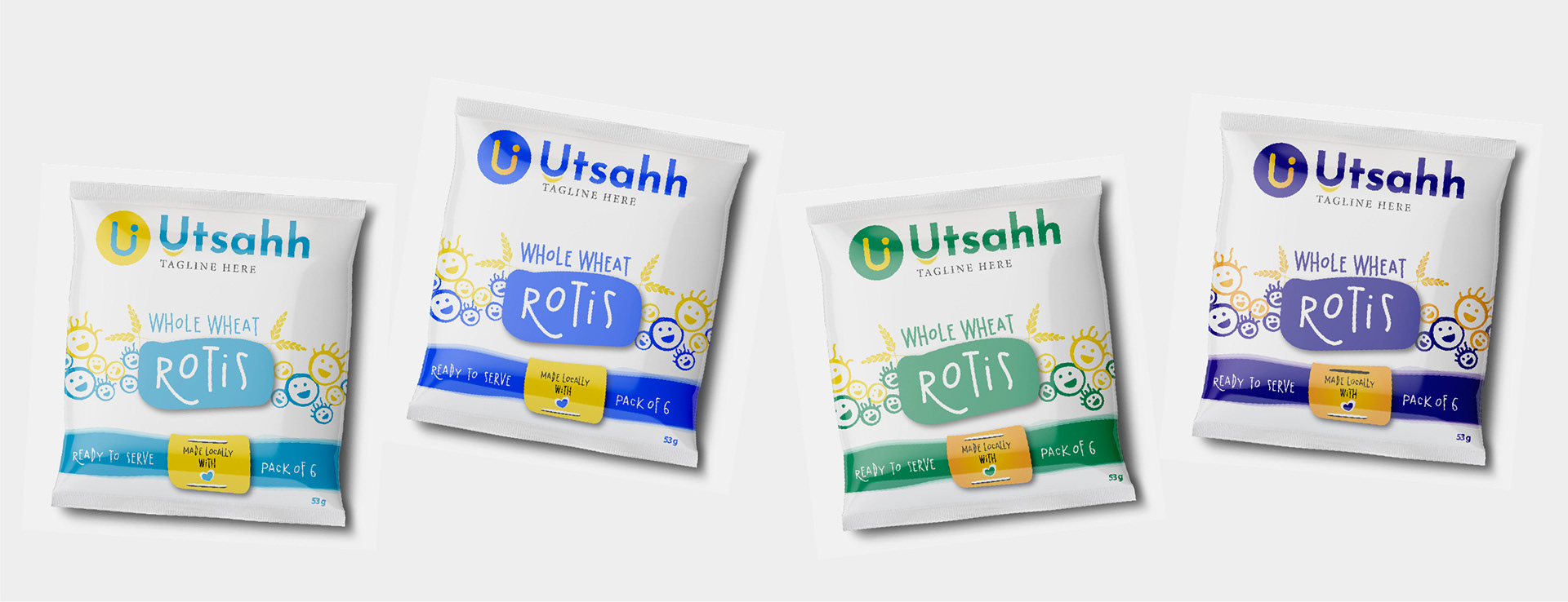
Final Roti Pouch Packaging
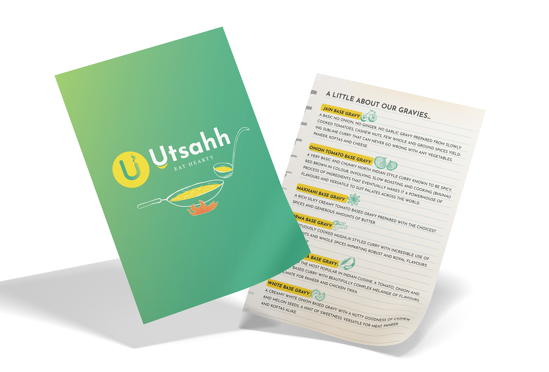
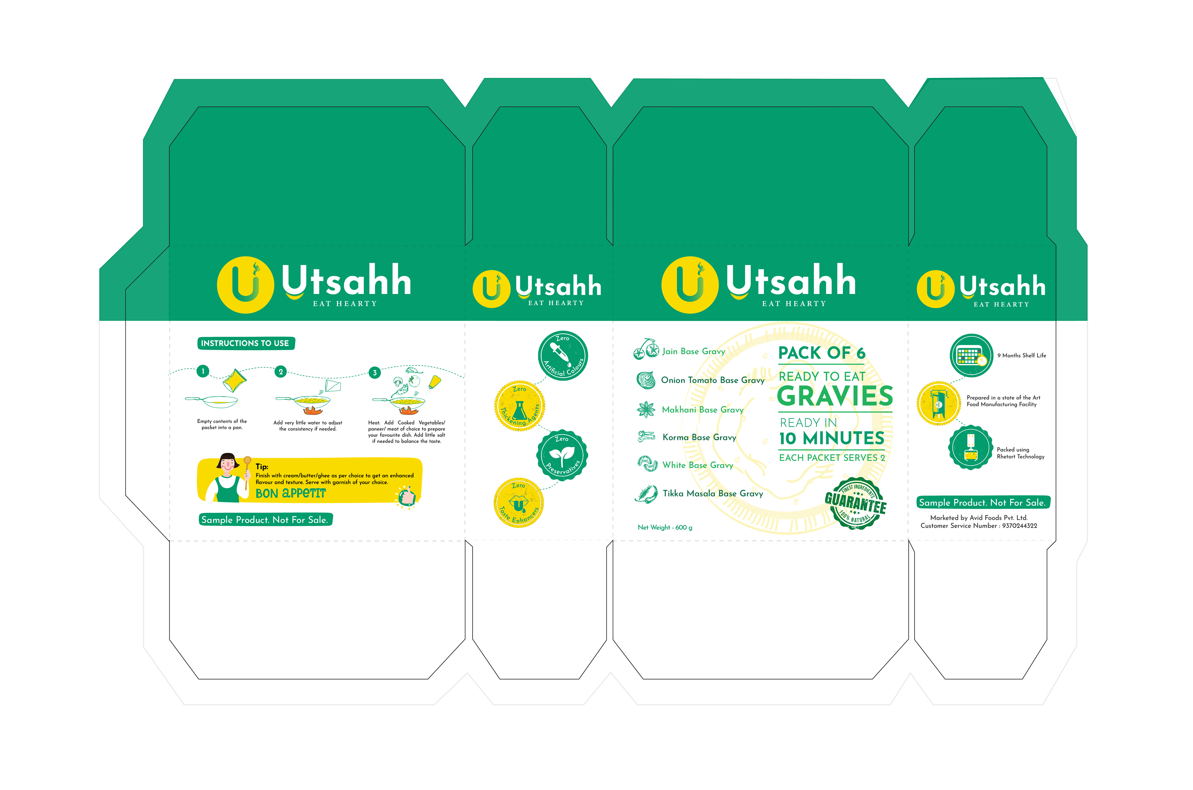
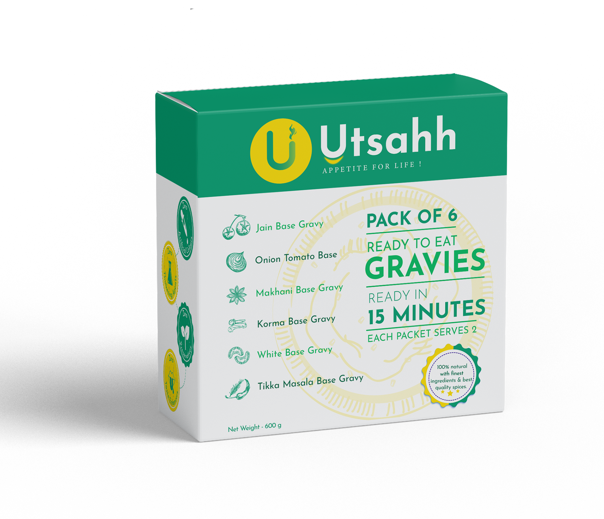
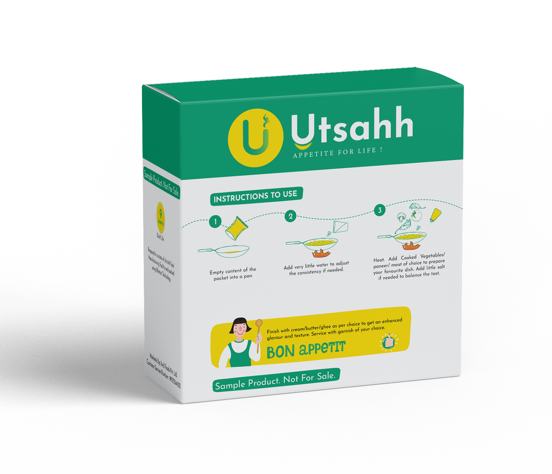
Final Gravy Box Packaging
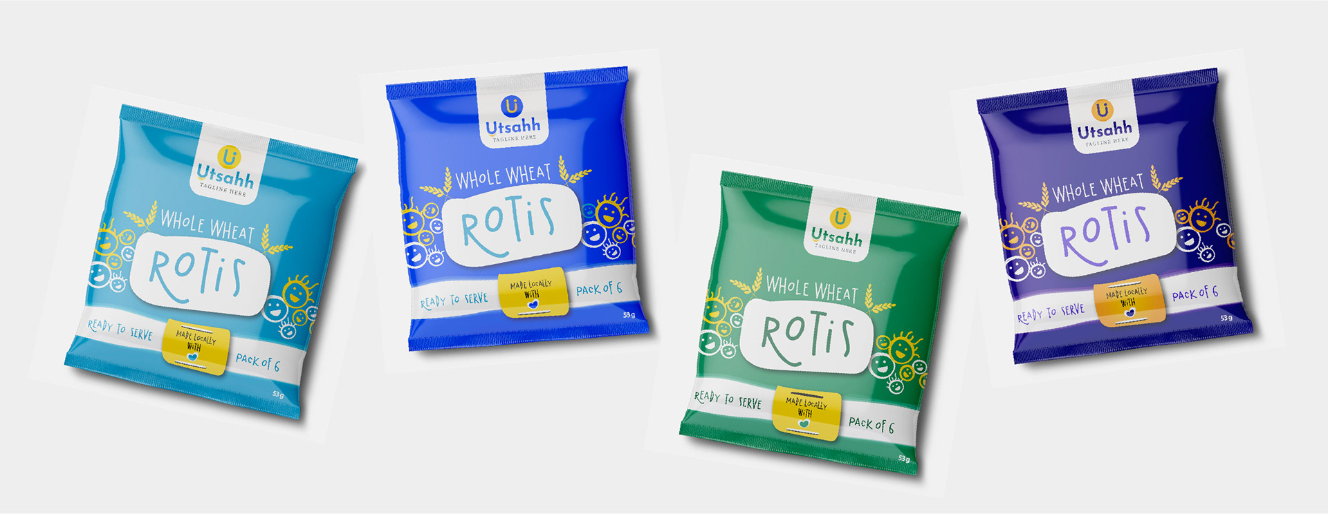
The Process: Option 1
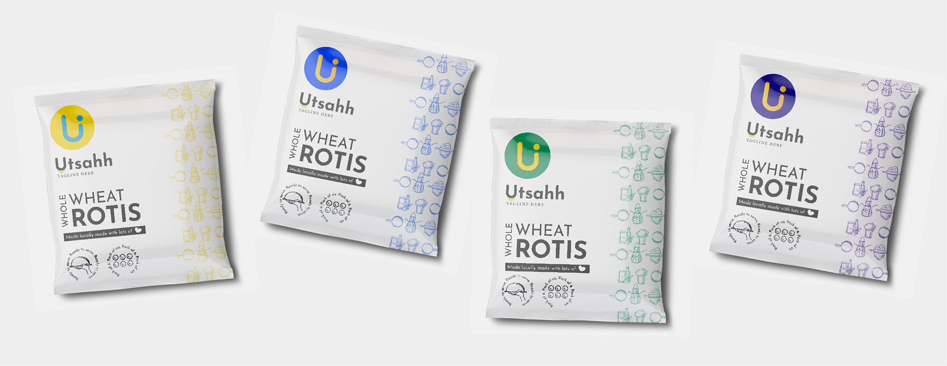
The Process: Option 2
The Process: Option 3
The Process: Option 4